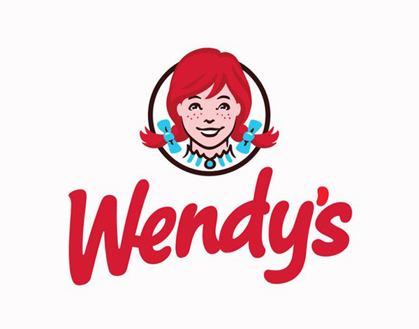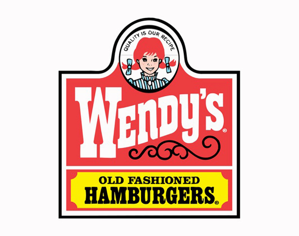

A few weeks ago Wendy’s, one of the biggest American fast-food chain in the U.S., and the third on the world, went through a logo and mascot overhaul and the final result is a much better looking brand which will be presented in an advertising campaign next March 2013.
Wendy’s CEO Emil Brolick said in a recent interview that the current logo had served the company well for the past three decades, but that is was time for an update. The company is pushing to position itself as a premium fast-food chain, with better quality than McDonald’s, but not as top as Panera. “Our goal is to be a five-star restaurant at a three-star price”, said Brolick to the AP.
Here’s what Armin from Brand New said about the new brand:
The new logo is an excellent update. All of Wendy’s elements are intact, but very nicely re-rendered. The hair now has volume (and styling), as opposed to the flat helmet hair of the old logo. The bows are more plump. The dress has been cut shorter along the neck so it doesn’t look like she’s going to a Renaissance fair. And the freckles, and the smile, and the innocent look are all there, inside a circle and not a weird oval. The wordmark is the more dramatic change. The brushy, hand-drawn, bold script approach is great: it feels friendly, casual, and different from all other quick-service hamburger joints. There are strange things happening like the “e” connecting into the “W”, the counter of the “d” being too hard-angled in contrast with the rest of the letters, and the “n” being a little wonky. But I could put a dozen of those plump apostrophes on my burger and eat ‘em all up.
Overall, I love the new logo as it’s a much more simpler version—and you already know I love minimalism in brand design—and it does communicate the sense of premium value the brand is looking for; shame there’s no Wendy’s here in London anymore.
