StumbleUpon alternative logo, perhaps the logo that should have been?
Back in 2011 StumbleUpon went through a rebranding process which resulted with an amazing update to their overall identity look-and-feel. While I loved the use of the more adventurous reddish in contrast to the odd combination of green and blue, I never quite well understood their choice for the controversial phallic shaped logo, in layman terms, the damm schlong.
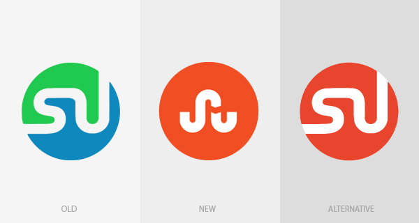
How the heck they have not seen the ding dong on their logo?
While I thought on writing about it at the time, I felt I didn’t have much to add, as the entire StumbleUpon community was already stating the obvious about the new unfortunate logo. But today, while stumbling some really cool stuff about space exploration (astronaut was my second career option, right after logo designer), I had this idea of applying the new identity look-and-feel to the original StumbleUpon logo, and I strongly believe it would have been a much better alternative. What do you think?