• Skip to primary navigation
  • Skip to content
  • Skip to primary sidebar

Logoness

Everything on Logo Design

  • About
  • Contact
  • Blog
  • Subscribe
  • Submit a Link

Southeastern Center for Contemporary Art New Logo

January 14, 2011 By Ray Vellest 1 Comment

SECCA New Identity Stationery

The identity appears in different configurations on SECCA’s stationery.

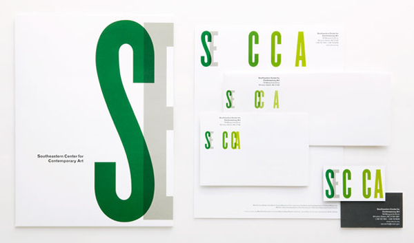
The Southeastern Center for Contemporary Art is an organisation bold enough to push the line of branding a bit forward and with the help of Luke Hayman and his team that’s what they just did by creating a fluid identity design.

Brand Identity in Motion

SECCA Fluid Logo Design

The new identity for SECCA is in a constant state of flux.

SECCA Old Logo

The previous SECCA logo.

Via Pentagram.

Filed Under: Blog, Branding, Innovation, Inspiration

Reader Interactions

Comments

  1. Paper Acrobat says

    April 14, 2012 at 9:16 pm

    Every time I see a Pentagram design it makes me smile. And I always think – wish I had thought of that. They are the best agency in the world right now.

    Reply

Leave a Reply Cancel reply

Your email address will not be published. Required fields are marked *

Primary Sidebar

Recommended Reading

Sale Logo Design Love: A Guide to Creating Iconic Brand... $26.35
Sale Designing Brand Identity: An Essential Guide for... $37.99
Sale American Trademark Designs (Dover Pictorial... $20.11

Categories

  • Advice (6)
  • Best (274)
  • Blog (168)
  • Books (1)
  • Branding (14)
  • Business (2)
  • Causes (1)
  • Design (3)
  • Experiments (1)
  • Freebies (3)
  • Gallery (5)
  • Humour (5)
  • Innovation (6)
  • Inspiration (28)
  • Interesting (17)
  • Interviews (1)
  • Logo Design (34)
  • Marketing (1)
  • News (19)
  • Opinion (2)
  • Portfolio (1)
  • Productivity (1)
  • Resources (4)
  • Review (2)
  • Showcase (22)
  • Tutorial (1)
  • Typography (2)
  • Video (11)
  • Write for Us
  • Privacy Policy
  • Terms & Conditions

Copyright © 2019 · Logoness