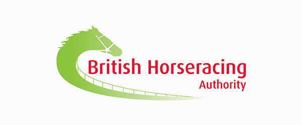
Earlier this year the British Horseracing Association, the governing body for horse races within the United Kingdom, decided to update their old logo to a much stronger mark to represent their organization. The old design was a bit unwieldy with the entire name of the association wrapped around by a green horse track and head.

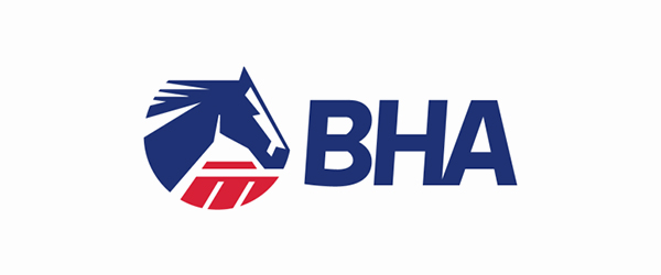
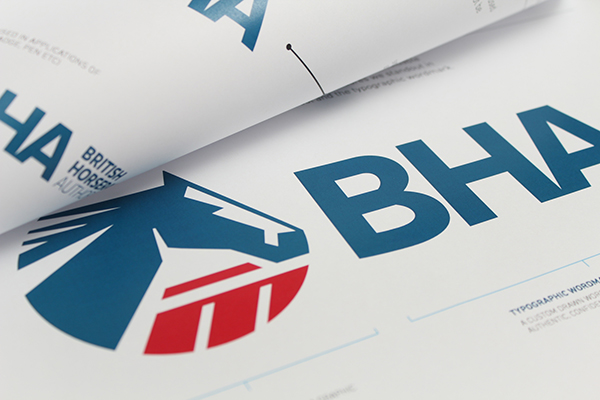
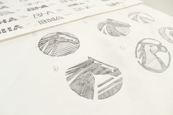
The new logo, designed by Firedog Creative, was built with a red-white-and-blue scheme which brings it in line with traditional British colors and it’s much shorter too. The fully spelled name has been replaced by the succinct BHA acronym, and the large green horse track is now a circular stamp of a stylized blue horse. As these two symbols aren’t wrapped around one another they can be separated allowing greater usability.


While the new logo looks like it could be decades old, it doesn’t feel unwieldy or out-dated. The BHA’s steps into the future ensure they’ll be able to show their brand without the concern that they may appear lost in the past.
