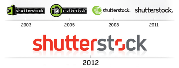

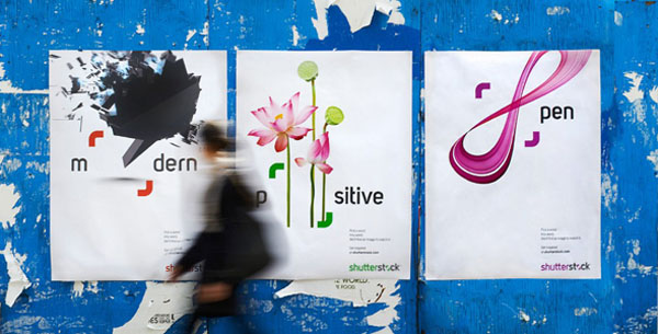
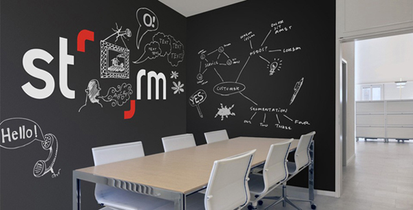
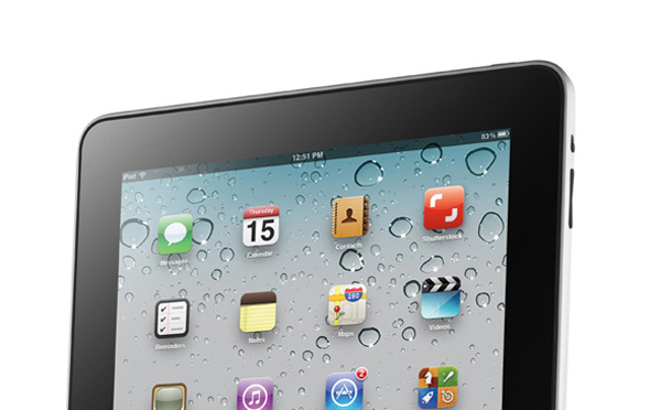
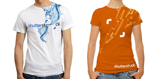


Earlier this year the ubiquitous digital marketplace Shutterstock went trough a logo overhall. Yes, it’s old news, but I felt like mentioning to bring attention to a point I’m constantly advocating for, simplicity. Many brands have been following this same path in this year, have you seen Microsoft Windows 8 logo or the new eBay logo? It seems that companies worldwide are gravitating towards branding minimalism.
Quite often minimalism in branding is refuted by designers for lack of personality, but I believe the true personality of a brand hangs on how it communicates with its target audience and not how its logo looks like. Surely if the logo looks like hell it constrict the amount of materials that can be created to promote the brand, but with simpler brands, the limit on what to do is set by the minds of the creatives behind its branding efforts.
Watch the video below to have an idea of what I’m talking about.
