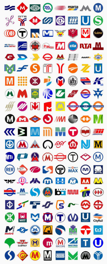
I’ve just stumble upon this finally curated collection of Metro logos from around the world. It’s quite interesting to look at all of this logos clamped together and how different designers have opted to solve their identity problem with very much similar solutions, that in itself, gives a great perspective on the subject of plagiarism, or better yet non-plagiarism. The way I see it, more often than not, designers come out with similar ideas simply because they work.
