


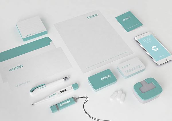
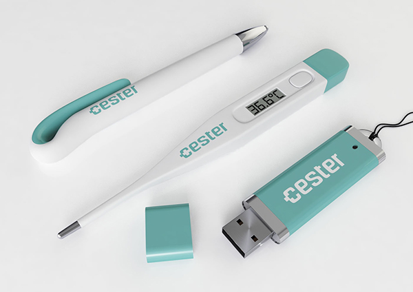
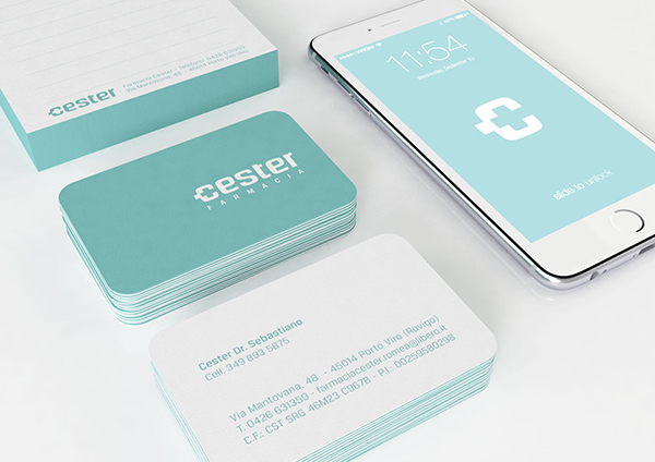
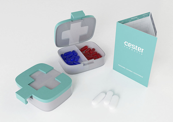



Cester is the name of a family of pharmacists, their small local business allows them to have a privileged relationship with people. The Cester visual identity was based on a set of core values: caring for health, professionalism, cordiality.
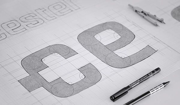
For the creation of the logo, we sought inspiration in the most recognisable shapes for pharmacy and we chose the cross symbol. We obtained this shape by the displacement of the central part of the “c” bowl. The use of negative space in logo design is a great way to catch the eye of the beholder, which is one of the most popular techniques for its effectiveness, because it creates an interesting visual effect for the human eye to fathom and it facilitates the memorization of the logo.
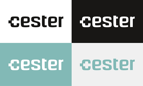
The lettering is clear and simple. We designed the typeface in order to give it an authoritative and professional look, which gives security. The use of lower case letters and the presence of particular roundings gives the logo a cordial look, too.
