
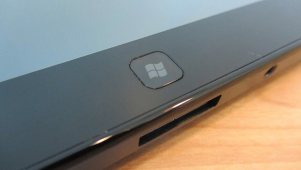
Is this the new Microsoft Windows 8 new logo design? Maybe, still to be confirmed.
One thing I would never expect to see is Microsoft losing their multi-coloured logo for a more minimalistic and iconic design, but by all means don’t get me wrong, if this Windows 8 new logo design turn out to be the real thing I’ll take my hat off to Microsoft. Regarding branding, it’s certainly the right move.
For the moment, this is just a rumour based on the photo below, taken of a tablet system which allegedly will be running Windows 8 operating system.
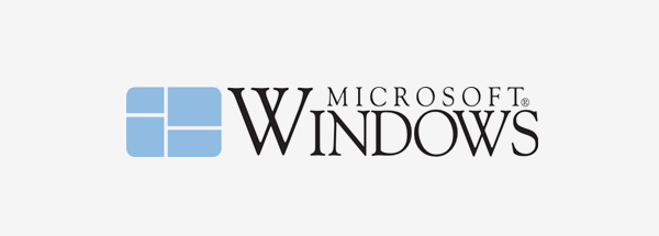
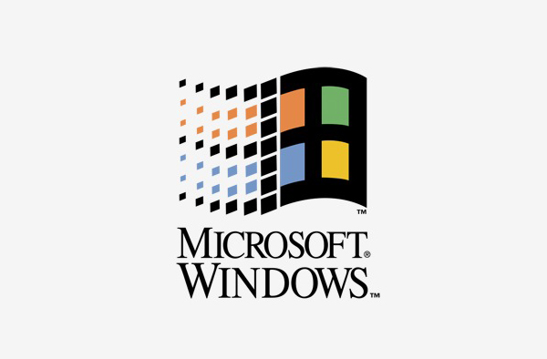
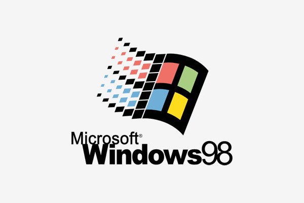
Previous Microsoft Windows Logos
Just to give you a better idea of what this rebranding means in the long term evolution of Microsoft Windows logo design I compiled this list which also includes Microsoft Windows version 1 and 2 logos, when they didn’t have even included the wording ‘windows’ as part of the identity.



Apple Branding Strategy
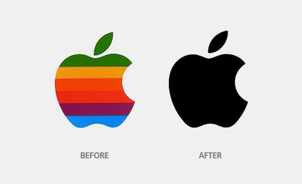
The Apple black colour logo was the update to change the Apple rainbow logo.
A move taken by Apple back in 1998 was to remove the multi-colours from its logo and they end up with a simple, yet iconic black brand. Is that a move being copied by Microsoft today? What do you think?
Update 18/02/2012
I‘ve just wrote another article with the official Microsoft Windows 8 logo which has been confirmed by Microsoft and has been designed by Pentagram.
