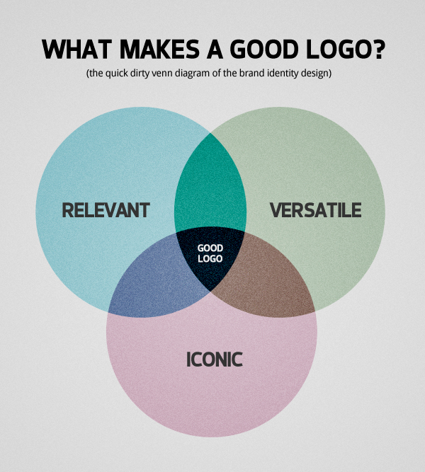
What makes a good logo? Put in the simplest terms, a good logo must be appropriate to its own purpose, be able to adapt to a wide range of sizes and materials while simple enough to stand the passage of time and be fairly easy to remember.
In other words, a good logo must be…
Relevant. A logo is an element made to create meaning, and ultimately represent a business, a company or a organisation. With that in mind, and before anything else, the design must be appropriate to what the business is all about.
Versatile. A good logo must be scalable to any size and adaptable to any material. What happen when you need to apply the logo on the side of a building or on the side of a pen?
Iconic. The simplest of the logos are usually the ones with greater chance to survive the passage of time and are also highly memorable. Try remember a few brands you know and visualise them in your mind, how many of them have a simple iconic logo design?
More often than not I feel my approach to logo design is that of someone working on a puzzle, as I’m constantly looking for these attributes. Quite obviously there’s more to brand identity design than that, but following these three principles will increase your chances of a good logo.
Truth must be said, I’m not really reinventing the wheel here, as this subject have already been successfully explored by many designers, including David Airey and Jacob Cass, but I felt inspired to write about the subject as I’m constantly explaining it to my potential clients.
What about you? What do you think makes a good logo?
