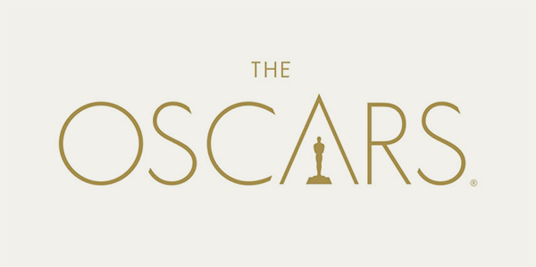
The Oscars is a worldwide recognized film award, so it was no surprise that design agency 180LA took two years working in the development of a new brand for such an iconic name. The result, as you see, is worthy of an Oscar on art direction.
The chief marketing officer of the Academy,Christina Kounelias, said that this design will give the Academy a presence in its own logo for the first time and underscore the efforts to support creative arts and sciences year-round.

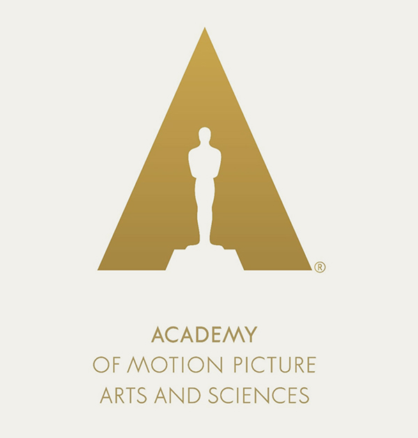
The new logo carries a negative shape of the ubiquitous Oscars statue placed within a triangular shape reminiscent of a studio spotlight. The entire composition also comes out as a representation for the letter A, the first letter in the word Academy, as in the complete name for the movie awards, the Academy of Motion Picture Arts and Sciences.
The head of design at the firm 180LA, Richard Harrington, said that the logo was inspired by the Academy itself, and that every last aspect of the design took into account The Oscars’ long and prestigious history. It’s more than a single logo, the Academy’s A was designed in such a way that it could be used as a consistent branding icon.
