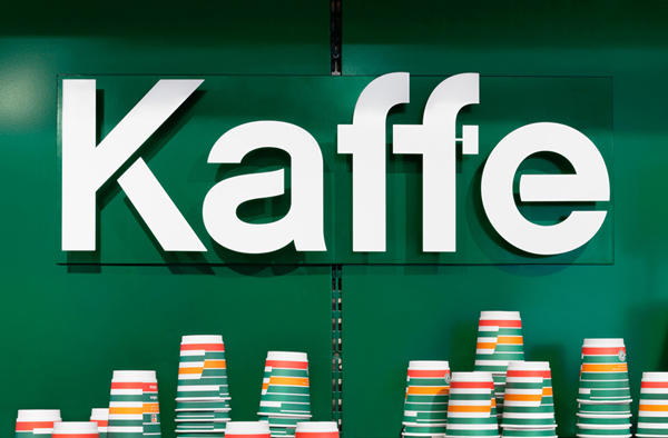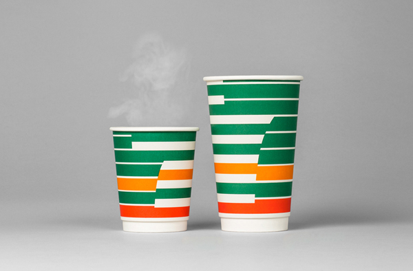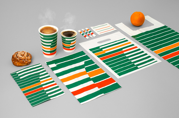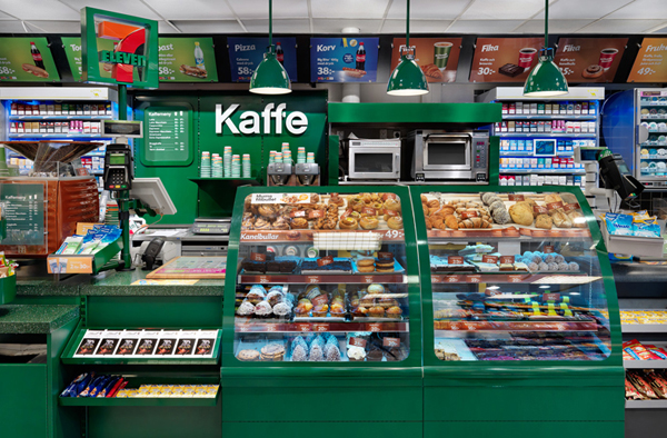


Earlier this year the Swedish branding agency BVD redesigned the identity of the ubiquitous 7-11 chain of convenience stores by updating its classic look with a re-imagined, much more impressive look-and-feel.
The result is an attractive mix of a vintage and modern style. The very first impression you’ll take from it, quite possibly, is the unusual choice of a color palette more typical of a 60’s kitchen than contemporary brand identity design work.
If you don’t like the work, bear in mind that BVD won a Bronze Design Lion in Cannes with it, so it seems that sometimes, a dose of getting inspired by past traditions, it just what a brand needs.
The only sad bit here is that the work has been done exclusively to rebrand 7-11 stores in Sweden. The US stores are going to continue using the old glossy shadowy, and if you ask me, that’s a shame to see such nice work kept away from where it deserves to be.
