
Founded in 1981, the Sistema Brasileiro de Televisão—that is Portugues for Brazilian Television System—or SBT for short is one of Brazil’s most popular television networks. It was founded in 1981 by Silvio Santos, a well-known Brazilian media magnate, and TV personality as the network owners is also a presenter in some of the most popular programs of the network.
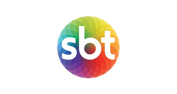
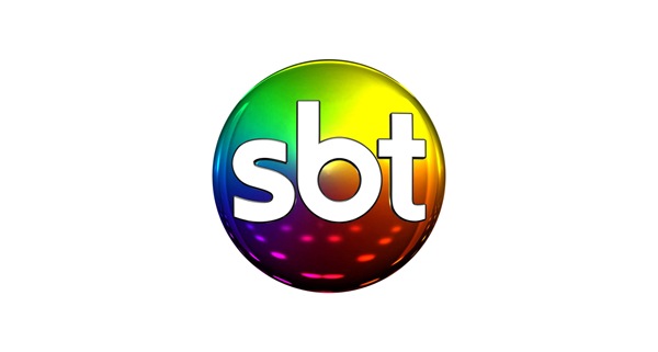
SBT logo haven’t changed much since its birth, with the company name (SBT) placed inside of a metallic, rainbow-coloured 3D looking orb, but now, thanks to a partnership in between their in-house designers and Publicis Brasil, the well-known television network has come to a different design.
The bright metallic sheen of the old logo is gone, replaced with a flatter image—one that is still portrays complexity in its simplicity, and while the multitude colours remained the same, the glaring, eye-catching brightness of the old logo is gone, evolved into a more elegant and quiet logo.
